John Burroughs School – Alumni Association
John Burroughs School – Alumni Association https://blisscollaborative.com/wp-content/themes/corpus/images/empty/thumbnail.jpg 150 150 Bliss Collaborative https://blisscollaborative.com/wp-content/themes/corpus/images/empty/thumbnail.jpgJohn Burroughs School
Alumni Association
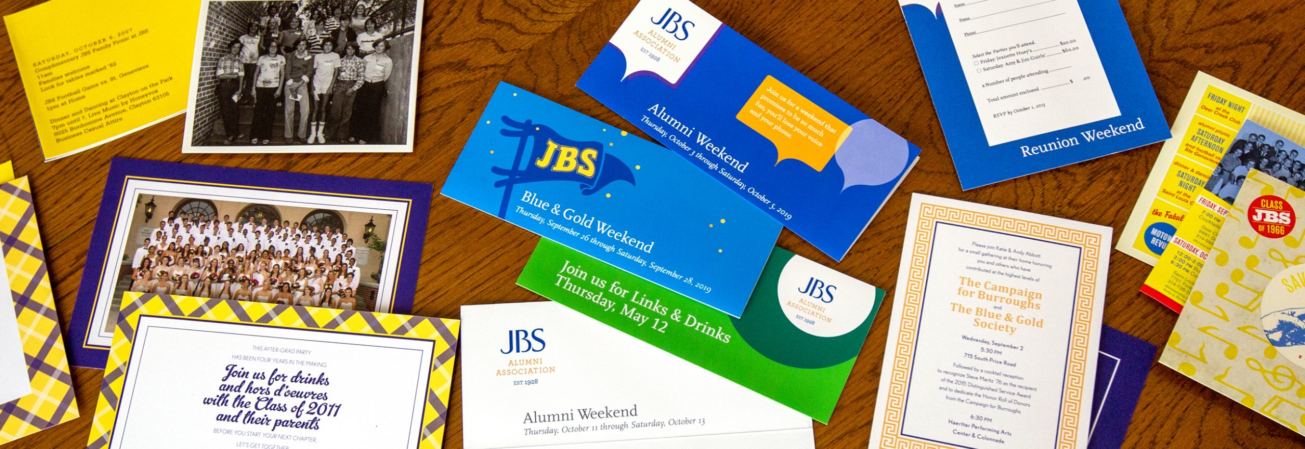
In 2009, what started as a logo redesign project became a decade-long partnership with the John Burroughs’ Alumni Association and Advancement & External Relations Office. Today, we actively support their events and giving campaigns year-round.
The identity for the JBS Alumni Association needed to distinguish its collateral from other pieces targeting current or prospective families. It needed to be as fun, cheeky and modern as the Association itself.
First, we designed a logo. We chose the brightest, most cheerful pantones from Burrough’s established brand and a casual serif font, Archer. The resulting logo is friendly, open and a tad informal.
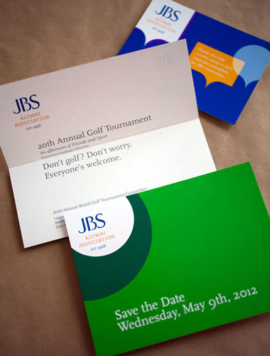
From alumni reunions to new building construction, we’ve created dozens of invitations and supporting print collateral, and complementary email marketing campaigns to engage the extensive network of Burroughs alumni and parents. In doing so, we gradually established the look and feel of alumni communications from Burroughs. We wanted alumni, when sorting through their stacks of mail, to spot an envelope or postcard and to open it right away.
Two simple goals emerged: be relevant and spark curiosity.
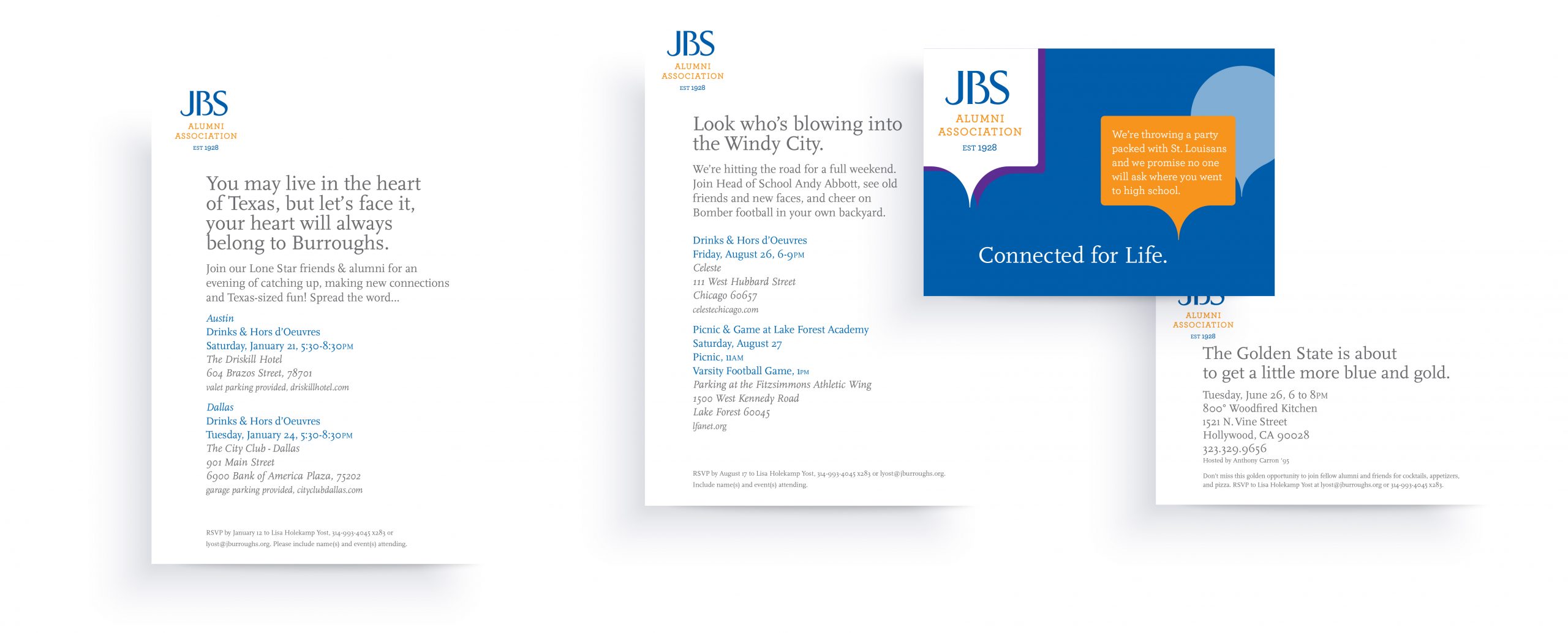
Relevance came into play with our local alumni meetup invitations. South Floridian alums are quite different from Chicago alums, who are different from people rooted in St. Louis.
When designing these event invitations and engagement letters, we tailored each piece to our defined audience with succinct, personal, tongue-in-cheek copy. State-specific invitations got self-referential, local flavor.

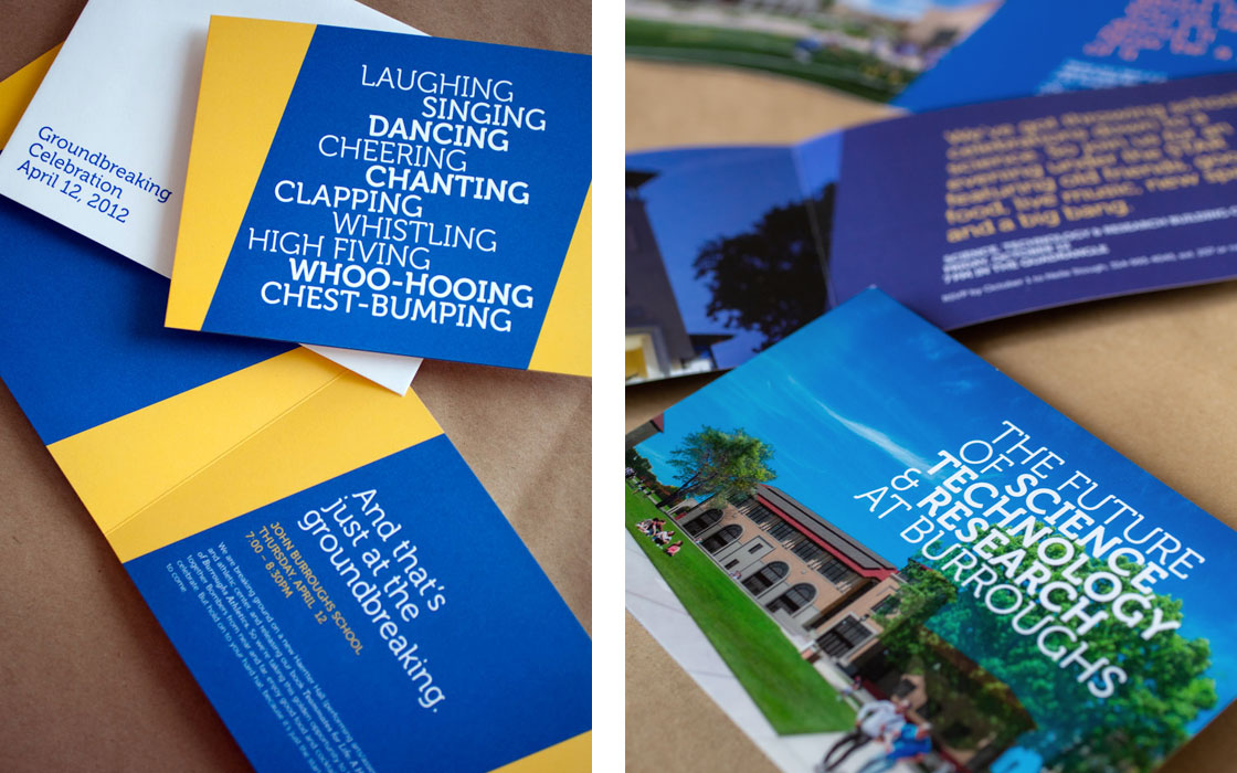
It is our job to create something that earns a spot on the fridge. Something that immediately reminds the receiver of why they love their alma mater. Because at the end of the day, clever copy and bright-hued visuals make for better mail—and for Burroughs, it made for better attendance, too.
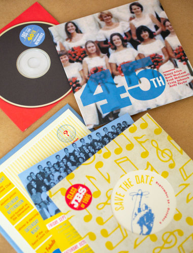
Class-specific invitations hit on that class’s cultural roots. For example, the Class of 1966’s 45th reunion invitation was based on old 45 rpm records.
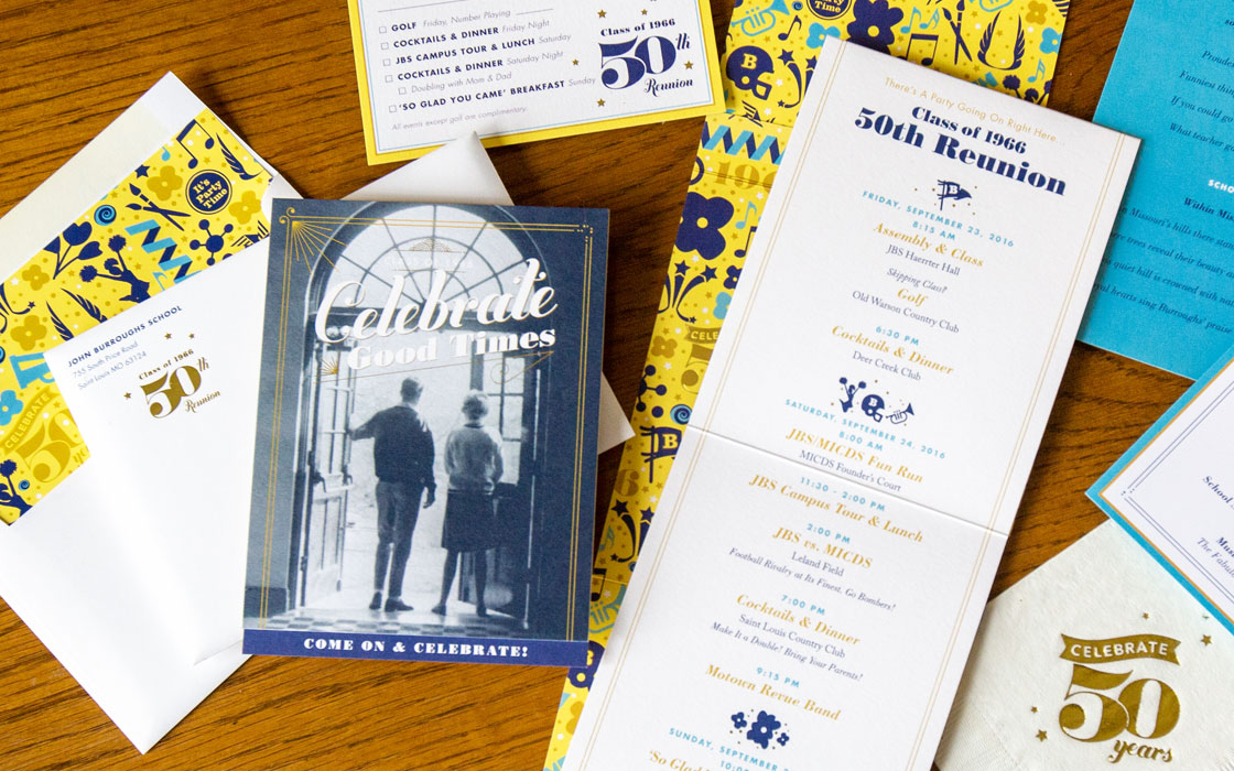
Super special events, like their 50th reunion, got the deluxe treatment: custom-lined envelope patterns and golf leaf adornments.

Results
The entire collection of print collateral has helped the Burroughs Alumni Association and Development Office start and end every engagement appeal on a high note. Its audience has come to expect something that’s familiar, memorable, modern, and witty—with top-quality cardstock and vibrant ink.
After so many years of consistent, cohesive designs, we’ve built a communications strategy for these offices that is both differentiated and aligned with the Burroughs identity at large. And the results speak for themselves. Burroughs’ invitation for the Groundbreaking Celebration had among the highest response rates ever for the school community’s special events. The Association continues to grow to this day, successfully raising more and more funds to support the school its alumni love so dearly.
33%increase in annual fundraising engagement
12+alumni supported events
each year
6,955
living alumni
1,313new members since 2009

